Showing posts with label DIY. Show all posts

Sunday, August 9

Thanks for Being My Local Business

This isn't the one I sent, but I do love making postcards.
This is an idea that's been building in me for a while: write a postcard to thank your local businesses.

A few years ago, I went to a kind of interactive arts performance/display at the Walker Art Museum. My friend Jenni, owner of Lunalux, custom letterpress print shop and stationery store, was running a project where people creatively designed postcards. Jenni had brought all sorts of fun materials—washi tape, old maps, cardstock, &c.—for participants to glue and reassemble in interesting displays. (I made one and thought I had a picture of it, but can't find it right now.)

Wednesday, May 21

Postcards for Humanity

Postcards, my friends of the pen. What are postcards? It's a small rectangle of cardboard with a short note and address on one side and a picture or even more note on the other side. They've taken many forms: you could write on a clean slice of cardstock and slip it into an envelope, and that was a postcard. In the late 1800s, in the U.S., it was not uncommon at all to bring your family to a portrait studio, have a photograph taken of your ensemble, and receive prints of your images in the form of postcards to distribute to family and friends.

Postcards were printed up for hotels, to distribute as mementos of your overseas vacation; postcards are the stock souvenir merchandise in every major metropolis, city, museum and gas station wherever you go. You can even make your own, if you want; find an interesting picture (or a lot, for a collage) and paste it to a stout piece of paper, writing all the usual stuff on the back. Make sure the destination address is lower than any other address on the card, if you're sharing your new address with friends, for example, and leave enough room at the bottom for the processing label.


Saturday, May 26

Opinions as Strong as Glue Stick

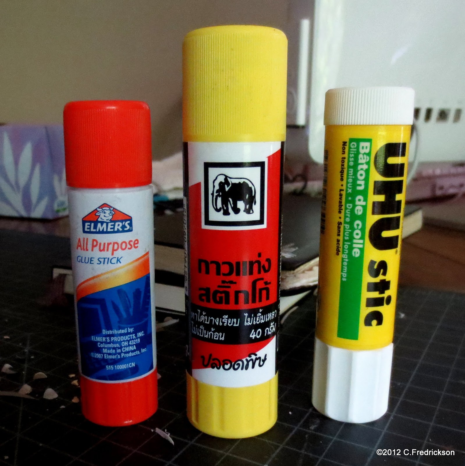
I'm sure everyone's been paying attention, but I feel like I need to be clear about my preferences in glue stick.

Is it urgent? No. I just like to boost for good products and warn against poor ones.

Is that geeky? Likely, but life's too short to want to be like other people, to live others' lives in replacement of one's own. And life's too short to be embarrassed—for very long—about flying one's freak flag.

I use a lot of glue stick (a lot) so I have some opinions about it. I've used it to craft and seal envelopes, to cover Moleskine notebooks, to wrap presents, repair library books, flyer around town, &c. In the course of using a lot of glue stick, one may develop a curiosity about alternative brands and, consequently, to notice trends and tendencies of one product against another. This is fine and natural, and I believe it's important to share one's impressions with others.

I'm sure I've used other, generic glue sticks before, and if I were very diligent I would run out and pick some up. I know Office Depot has a house brand, and Target probably carries alternate brands. I'm only reviewing what I happen to have on hand.

Saturday, April 28

DIY Deco: Moleskine Notebooks

Now, anyone who's read EVERYTHING I'VE EVER WRITTEN EVERYWHERE may have detected by this point that I'm favorably inclined toward Moleskine (MOLL-eh-SKEEN-eh: I correct myself whenever I say it). And I have found there are two Moleskine websites: Moleskine (Europe) and MoleskineUS. Why are there two? I dunno, maybe it's just easier to have a European headquarters that takes care of all nations outside of the U.S.

The Euro Moleskine site has what they call an Artists Marketplace: users are invited to buy Moleskine notebooks, decorate them inside and/or out, and sell them here to a global market. I decided to try my hand and take the plunge, but so far there have been no takers. None from other countries, anyway: my friend Kate met me and, over ice cream, perused my selection and decided which (of the three I'd produced) she wanted.

Let me tell you about these notebooks. I purchased the pack-o-three "large" unlined Moleskine Cahiers with kraft covers. Among my statio is a file of old maps, so the notebooks are covered in a 1965 National Geographic world map. Their covers feature the South Atlantic Ocean (pictured), the North American continent, and the Scandinavian nations and northern Europe.

Sunday, February 19

DIY: Notebook Made of Junk Mail

Hmm, here's a ridiculous little project for when you've got too much time on your hands. Maybe you had a really strong coffee and—like me—maybe you recently came into possession of a large quantity of chocolate chip cookie dough, and you make yourself piles of cookies with wanton abandon. That's where your energy comes from.

Look at this: investment companies, radio stations, and
grocery stores are just throwing resources at you.
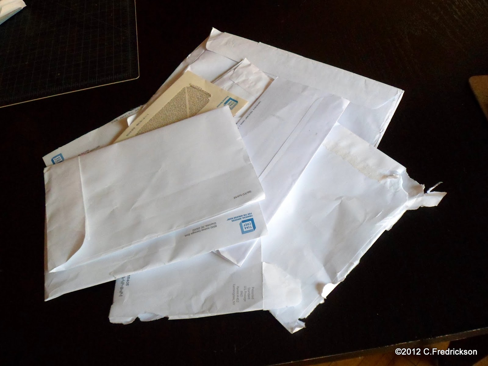
And let's also say that—like me—you have an endless and unstoppable stream of junk mail flowing into your living space. Further, let's suppose that—like me—you don't have any paper product recycling infrastructure in your neighborhood. Glass and aluminum, sure, but not paper. Weird, right?

(Also, we seem to have a lot in common. Maybe we should hang out?)

Monday, December 19

How the Grinch Reduced His Carbon Footprint

Now, this blog is a lot of things: a guide to language, a review of postal services and conditions, a showcase for stationery-related images, and infrequently updated. I want to emphasize that it's good for many things related to paper, whether or not it's something that bears an address and stamp on it (though of course it could be put through the mail).

Here we are in the holiday season, with Merry Consumermas rapidly approaching. I'm not particularly religious: I consider myself spiritual but have little interest in discussing such matters. My personal questions are answered, and I opt to leave others to their own affairs. But what gets me down about this time of year is how far people have moved from the realm of the spiritual or even the human and wholly subscribed, unthinkingly and unconscionably, to material gain. It's just not a holiday unless you can throw a pile of injection-molded plastic trash at some child and impress upon him/her at an early age that the point of the holiday is not an end-of-year celebration of gratitude among friends and family, but that it's solely about getting and having stuff.

Wednesday, May 25

Today We Mourn An Address Book

In the process of moving into a new place, in the process of taking things out of boxes and finding places for them to go, one is forced to reconcile with what one wants to keep or [donate/regift/trash].

Red Horseshoe (link in my sidebar)
provides many fun and exotic
accouterments for letter-writers. 
This process also happens when one is packing things up in the first place. One is compelled to touch and handle every single stupid object one has accrued, and after 10,000 repetitions of this action one has to wonder how much stuff one really needs.

We have augmented this process with a third step in the middle: placing all our crap into storage. It happens in the middle. We packed everything up, placed it in a climate-controlled storage facility, and now we're shipping it from the facility to our new apartment. When one puts things in storage, one is compelled once again to weigh the worth of each object and how badly one needs to keep it in storage.

I love Moleskine notebooks. I love them so much, I've bought too many of them. I've rationalized and bargained my way into getting more. Why? I dunno. I love the concept of them, I love the color and texture of the paper (though admittedly Clairfontaine/Rhodia is consistently better), I love the reputation that comes with them. I traveled throughout Asia happily penning (most of) my adventures in a Moleskine, and it was no rare occasion to see other tourists with their Moleskines doing exactly the same thing, as tourists have done for decades.

Not personal information: that's no longer my number,
and my name/e-mail are easily had through this very blog.
But if you use a notebook sufficiently, there has to come a time to get rid of it. Obviously I would never throw away a travel journal, but there is a point when an address book has outlived its usefulness. Like when you fill one up, lose contact with many of those people, buy a new one, transfer the addresses you need, and that new one also comes with a smaller address book that could be used for some special... addressy... purpose. Yet to be determined.

So what happens to the old one? You could tras-... no, you could keep it. It's like a souvenir of an era, right? A chronological souvenir of where you've been in life's journey. And you have to protect those addresses, too. Even if you're no longer speaking with some of those people, you don't want to just hand out their addresses, phone numbers, and e-mail addresses to anyone on the street, and if you put it in the trash you're basically doing that. Trash is public access, after all. TV and movies are full of people finding all sorts of things out about you by going through your trash, even stealing your identity. And that starts with knowing your address.

I decorated the interior with labels from sheets of collectible
 stamps, an original linocut, and misc. stickers.
That sounds good, but when the fervor dies down and your vision returns, you know you've got to get rid of it. It's no good keeping it. Small as it is, it's still taking up room and it still needs a place to go. I have a much better one and though those addresses are also going extinct, it's easier to paste over them with Moleskine paper from another notebook because this new address book is larger. So when you want to throw away something you want to keep, what do you do?

It's easier now than it was before: take a picture. In the past that would've meant turning film in for development and waiting a week to pick up another physical object to take up space in your life. Now, however, I can take a digital picture and store it on my laptop. So everyone can take a moment and meet one of my beloved Moleskines even as it's on its way out the door.

Thursday, June 17

Making a Fold-and-Mail Letter

I'm still working on this, a project in progress. I know there's a simple and obvious way to make a good fold-and-mail letter, but I haven't quite put it into practice yet.

Observe my crude pattern on the left. Ideally, the bottom half of it should fold up into the top half, and the flaps should not only enclose it securely but the corners should run flush against each other as well.

Can't say that happened exactly, though it was close. I'm making these as part of an interactive project from Facebook--actually, I probably mentioned it back in April. Too lazy to check right now. The gist was this: I posted a meme that solicited five people to sign up (who would also repost the meme). For each of these five people I had to create and send some kind of creative project, and since all I know is stationery, I thought I'd make some postcards and a fold-and-mail letter for them.

It's just that I didn't think this thing through. Each fold-and-mail item is one exterior and two sheets of paper, each sheet being half of one regular piece of paper. I glued in the sheets at the top, just below the large upper flap, so you could fold the exterior and the sheet-halves in their middle, then seal it down with the three flaps.

I think, to really help the folding and the edges meeting up nicely, one might trip about 1/8" off two perpendicular sides of the sheets of paper, but not the exterior. This should give the paper enough room to bulk up with the fold and not create extra space before the flaps can fold in.

But here's my pattern, if anyone else thinks they can use it. This isn't the cardstock envelope I promised back in December. I'm sorry about procrastinating on that thing, but I haven't forgotten about it, and maybe crafting and scanning my design for this project will motivate me to perfect and upload the envelope pattern.

Anyway, the flaps seal with double-sided window insulation tape. I trimmed it in half lengthwise to be narrow enough for the side flaps--otherwise, you can't beat it for adhesion. Leave the backing on for the letter-sender to peel off just prior to mailing. Better solution than sending everyone a glue-stick they'll use once and lose. And the address labels are my own design: I carved out the border in linoleum, stamped it onto parchment, then cut it out closely and glued it to the front of each exterior.

Sunday, May 23

Carving a Pen Chamber in a Moleskine

I think I've touched on my Moleskine (pron. MOLE-eh-SKEEN-eh) love before, right? The little black notebook that comes with the onion-skin pamphlet explaining how the notebook this was modeled on was actually the favorite of, like, Michaelangelo, Van Gogh, Hemingway, Jackie Chan, the Dalai Lama, &c.?

Someone forwarded me an online article by Treehugger, featuring six "awesome hacks" for your Moleskine notebook. Granted, I could easily buy enough Moleskines to build a small cabin, but it never occurred to me to get one just to mess around with and deface. So my wife surprised me out of nowhere by buying me one expressly for this purpose. "Get silly with this one," she said. "This is your Moleskine to go crazy with." She knows that I revere the Moleskine as basically a perfect end-product, so anything I put into it has to be polished and notable, but she believes I should let myself off the hook and get stupid with this one.

I decided to start with the hack in which you carve out a small chamber in which to lay a pen. The idea, ostensibly, is that you always have a pen with you when you grab that notebook.

Firstly, I'm never without a pen. Usually I've got two or three in my pocket, and even more if I've got my SwissGear air travel bag. I'm more likely to forget to bring a Moleskine than to grab a pen when I start my day.

Secondly, I really didn't want to screw up a nice Moleskine with my amateurish efforts. I don't know how the guy in Treehugger did it, but I'm guessing a Dremel would've been handy, whereas all I have are a couple X-acto knives and a boxcutter around here somewhere.

But I did go ahead and try it out, and here's my advice for anyone who'd like to do the same.

  1. You can trace out the shape of the pen like I did, but now I'm kinda wishing I just went with a straight-line, right-angled rectangular box for the pen. I was thinking I'd create a more form-fitting chamber for my Slicci.
  2. You can start digging next to the spine (and expect the pages may be a little flimsy to turn) but I would recommend centering your chamber vertically. I started mine out too close to the bottom and the first six pages shredded down by where the cap is pointing. Too close to the edge, especially for a beginner like me.
  3. Use differential light to help with the cutting. You can see where your initial cut's supposed to go, because you've traced around the pen, but after that you're relying on the scratches that penetrated previous pages and those can be hard to line a knife upon. Set up a lamp to one side and, if you can, use natural daylight on the other side. Every contour and indentation will be much easier to discern.
  4. Dig a rut in one side: once you've made your cut, retrace it over and over to dig deeper into subsequent pages. If you just trace the pattern over each time you get to a new page, you increase the likelihood of imperfectly replicating the shape and misshaping the chamber. You really want this thing to be as tidy and homogeneous as possible, and you can achieve that by digging in the same spot a few times.

Oh, also: remember to pull that woven fabric bookmark out. When you get to the middle of the Moleskine you won't slice the bookmark, but its presence will mess up your careful efforts to retrace the chamber.

But most important of all...

Use a fresh, new blade in your X-acto knife. I used a dull blade almost all the way through this project and it was a lot of work and took hours. When I replaced the blade with a new one, I nearly wept over the difference. I could have shaved an hour off my time and done a significantly more precise job with less effort and fewer mistakes.

Sunday, April 25

The Office Outfit

Can you imagine owning your own "office outfit?" I'm not talking about a nice tweed suit with Oxfords and a tasteful silk tie. I'm talking about this little thing: brown cardboard box and electric blue lid containing an entire set of stamps for making your own customizable rubber stamp. Multiples of each letter, upper and lower case, stored in a nice wooden rack, waiting to be arrayed in a wide, thin handle for printing.

What would you use it for? When would you use this thing instead of a typewriter? When would it be more economical to assemble your own line or two of typeset rather than contacting a professional printer?

I suppose it would be handy to confirm receipt of certain documents, though it doesn't strike me as the pinnacle of convenience to throw "Received by" into a rack and stamp it out for a few pages, then replace all the letters--and I'd put them back in alphabetical order, though some people would just put them back into storage and call it done.

It would also be handy for printing on unconventional surfaces, like, a label on a bottle or anything else that couldn't easily be fed into a typewriter. It could be handier to print on a porous surface rather than feed a sheet of labels into a typewriter or something, I suppose.

This was an artifact of my grandparents', when I went to visit grandpa's house in Idaho (grandma has been deceased for several years). In my last trip two years ago, it was very important for me to go through their office supplies and see what were the accoutrement of their day, what they found necessary or handy to have around. My grandmother was a high school teacher and my grandfather dealt in real estate, and they must've done some considerable business at home, based on two rooms that have been sequestered for an office and storage for office supplies.

Tuesday, April 13

Travel Stationery Mini-Portfolio

For my birthday, a friend made me a special gift. By "made" I do mean this thing was meticulously hand-crafted, as she is a very crafty person. She enjoys sewing and stitching with creativity and precision, and she has gifted my wife and I with her craft before. Prior to this, she made some super-strong grocery bags with two sets of handles: large loops that can go over a shoulder for large loads, or small handles for lighter trips. She chose especially attractive fabric for these, going for a travel/international theme.

This time, she made me something that blew me out of the water. It's a cute little travel portfolio for correspondence--she stitched "Correspondence" on the cover--that ties on one side or opens into three panels. The panels hold a medium-small Moleskine notebook, then a pocket for paper/cards and envelopes, a loop for a favorite pen, and then a smaller pouch for business cards.

I enjoy going over the details of this design, and I'm blown out of the water that someone would take so much time to construct such a device. I'll use it a lot, but for anyone else it might be quaintly archaic, and a more suitable gift would be an iPhone pouch. But this is perfect for me (she monogrammed the back to personalize it) and I'm still marveling over it. It's perfect, of course, and I haven't found anything in my online perambulations that could suffice with all this function. I've shopped online, see, and haunted the local art and office supply stores, but this travel portfolio (I don't know what else to call it) couldn't have been more suitable if I'd laid down the specifications myself.


So maybe some of my friends don't enjoy taking out the time to write a letter, like I do, and laugh at my need for postage stamps while they knock out e-mails that flash instantly across the globe. But this gesture shows me that someone appreciates my interest and supports it. My response, of course, is to plan something creative and demanding with which to rejoin. That's not a bad trend.

Friday, March 12

DIY Challenge

How exciting: one of my collage postcards has reached its destination! Well, all three of those I've sent have, but this is the first online documentation of receipt. I'm unfamiliar with the Multiply Web site, but I'm unwilling to start an account there: I already have online image storing facility and am part of too many communities as it is.

I'm on Facebook, and a friend of mine posted a little online challenge, I suppose one might call it. The friend in question manages Lunalux and the challenge was this: the next five people who respond to this will receive something handmade from me. Further, the respondents must post the challenge on their own profile and entice five more people to respond. I signed up for this and reposted on my profile, thinking no one would see it: I think most people have me blocked because I post so much crap with games there.

But five (technically six) did respond, and now I'm dreaming up what I'll send them. Stationery for sure: maybe some collage or personalized postcards, maybe some writing paper and envelopes, and maybe linocutting will be involved. I think the deadline is that these things have to be out by the end of April of this year. I'm encouraged by who responded and look forward to producing something for these people.

Sunday, February 21

Letter Writers Alliance

Here's something I'm very excited about: dusting off my Cross and Retro 51 pens, filling them up with Noodler's and Mont Blanc, and sitting down to write on this lovely stationery from Letter Writers Alliance.

Last weekend I went to visit my favorite stationery store, Lunalux, because my friend and its manager, Jenni, was producing customized stationery to promote her new Stationery Saturdays event. For $29 I got six pocket notebooks with my wife's name printed on them (I kept one for myself but gifted her with the rest), having selected the cover and the paper within. Very nice stuff, and then I hung around for conversation.

Jenni asked me if I'd heard about the Letter Writers Alliance and I had not. I had just finished telling her about my standby, Postcrossing, and that's why she mentioned this group. Part DIY store, part pen pal group, and more than those, LWA is a branch of 16 Sparrows which has a broad range of interests in crafting, retro aesthetic, photography, just a lot of very creative stuff. Not the highest, cutting-edge creativity because that's too inaccessible: this place is a study of how people can bring creativity into their own lives, how they can compel it out of themselves. That's what makes it dear and sweet: it encourages everyone to do their best and assures them that it will be great.

But the LWA! I'm excited about this. I got my brown-paper-and-string package in the mail, broke into it to check out my stationery, immediately put my LWA pin on my label, filled out my membership card, logged onto the members-only area of their Web site, and dwelt in a geeked-out haze for a while. I'm trying to think of any other discrete event in recent past that has made my writing-hand itch so badly to begin reaching out to my friends. This afternoon I've written two notes on this paper and will write more. I'm going to write to the people who have been most important in supporting my need and custom for correspondence (e-mail inclusive), so I had to get a photo of this paper before I sent it all out.

Now I want to do more with Postalatry, dress this place up and try to appear a little more relevant just in case anyone from LWA happens to swing their eyes my way. I'm just thrilled to be part of this very nice-looking creative group, excited to be writing letters again (I never stopped writing postcards, but it's easier to do that when you do not expect anyone to write back, as per Postcrossing), and feeling more than a little validated in my interests. Some of my friends like to poke fun at the antiquity of some of my pastimes, the... I lost the word, I had a great word that specifically centered around the interest in things that are old, specifically for its oldness. And that's not me, but it's useful when representing the crap I take from people whose values lie with the latest technological breaking news.

So I'm glad to be part of the Letter Writers Alliance.

Sunday, February 14

Mystery (Partially) Solved

The astute reader may recall how proud I was of constructing these accordion-sided envelopes for distribution, how I'd labeled them with these address labels from Red Horseshoe, and how one fell off of the envelope in the mail, so the letter was lost but the post office delivered the address label (bereft of envelope and missive) to the intended destination.

Sounds silly, doesn't it? The post office's behavior? "Sorry about your letter, it's gone and trashed, but we thought you would value this address label."

But how does an address label fall off of an envelope? The paper of the envelope I chose is stout and porous, any adhesive should hold to it. Except the Red Horseshoe adhesive does not: with a liberal soaking, it can't get up enough gumminess to adhere to anything, though a sticky paste is formed so it's clear that this is the intent. I finally did get the label to hold to the envelope by gluing it down with glue stick, and when the label fell off I was afraid the cheap-ass glue stick had failed. The astute reader will recall my rejoicing at having found an "extra strength" glue stick.

It wasn't the glue stick at all. It was the address label.

I dug out the other envelopes I made and tried to pry off the address label, expecting to find a dry, crusty bed of failed glue stick. Instead, the paper address label lifted clean away to reveal a plastic backing, as though the address label were a sticker to be peeled off of its backing and affixed to an envelope! There were no instructions with this book of address labels (they're bound together on one side and you tear them off as you use them), and the process seemed fairly intuitive. I mean, the apparent back did have an adhesive on it that responded to moisture. But I was entirely unaware of this plastic backing to the label until ten minutes ago!

The back of the address label is slightly sticky, so it sticks slightly to the plastic backing but not to the paper of the envelope. Even if it was intended that you peel off the backing and apply it to the envelope, it would just fall off anyway! Does it need to be further moistened and adhered to the envelope, or do you peel it away from the plastic backing in order to have a clean surface for yet more glue sticking? I'm trying to find the pad of Red Horseshoe address labels so I can determine whether they are supposed to be stickers you peel off and use, but I can't find the pad anywhere so I may have thrown it away in a huff.

Oh, and mind: the plastic backing also flakes uselessly away from the front of the envelope. There is no part of this address label that is prepared to stick to the envelope, in summary. I love the retro restorative look to Red Horseshoe's products, but I'd much rather they work properly. (Note: I can't find these address labels anywhere on their Web site. I'm guessing they called it a wash.)

Monday, January 25

To Slice, Glue, and Rearrange

I first read about this form of collage as "Victorian collage," probably in The Surrealist's Handbook or something. Victorian women used to amuse themselves by cutting out pictures from newspapers and magazines and gluing them together in whimsical, imaginative rearrangements. You can imagine how appealing a group like the Surrealists would have found this and soon it was the rage. Even today, when someone wishes to represent the jumbled thoughts of insanity, an artist may find it convenient to fall back on Victorian imagery for a somewhat nightmarish effect.


I have no such imagery. Well, I do, but it's in its original form and I'm not going to savage it just to make tawdry, half-conceived artistic stabs. I do, however, have other magazines with beautiful, stylized photography. For this card I used an old map of Tokyo, recreated by Cavallini Papers & Co., and then cut out pictures of arms from an old issue of Flaunt Magazine. The hand with the compass was from a Hennessey ad, the girl's hand from an ad for Bioshock, and the jack-all-points arm from some tedious photo shoot for a clothing designer. You know how those go. Well, they're not entirely without worth, as you can slit out a limb or maybe an intact garment for superimposition.

I had an X-acto knife on hand and recently purchased extra-strength glue stick. I glued the blank postcards onto the back of the map first and then cut them out, to ensure they would lay flush to the edges. I had no vision for the imagery to start with, just cut out an arm and then found two more. I lucked out with the "tomorrow calls," though, also unplanned.

And many people on Postcrossing object to homemade cards (for reasons unknown to me) but I still think cards like this will come in handy in special occasions. And I can scan them in for my own portfolio, and even upload them to any of the dozens of online postcard-printing operations (I've had success with Zazzle in the past) that have sprung up in recent years.

Update: Made some more cards. Expanding collection will be archived here.

Monday, January 18

Making Your Own Cardstock Envelopes

Okay, here's a little something: when sending the holiday cards, we ran out of envelopes. I had to make my own, a process to which I am no stranger, but the cards themselves were almost square. When compensating for a little room beyond the card's edges, the envelopes were almost completely square. The bad thing about that is, square envelopes and postcards incur a 13-cent penalty. Granted, thirteen cents isn't going to bust the bank, and room for stamps isn't an issue since you can put stamps anywhere you like on the face of the envelope (they told me so at the post office), but... call me a traditionalist and a stingy bastard: I didn't want to spring for the extra postage.

So I designed an envelope. I'll update this post with a nicer PDF copy of it, that will be my gift to you, my four readers, but here are the photos of the process.


Okay, in the first picture, what are we looking at? The envelope itself is two separate pieces of paper: the front is a nice decorative piece of cardstock, and the back is a very simple, very plain monochromatic piece. The top line drawing is the back and the bottom cutout will be the template for the front piece. I chose those angles for the tables completely arbitrarily: I'm guessing it's about 30º. You could use a 45º angle or whatever you like, actually. The important thing to understand is that the front piece has two side tabs that will be pasted on the inside of the body of the envelope and one large tab on top that will be folded down on the outside of the back. The back piece only has one bottom tab that will be folded up into the inside. I think you can see where I'm going with this.

The second picture represents each piece cut out in the desired materials. My wife found an excellent book of patterned cardstock, available at any scrapbook place for certain. Should be available in any craft store or some stationery outlets, perhaps.

The third picture is how you will lie the bottom tab of the back piece onto the low edge of the front piece. I made that flap extra big on purpose because I'm using that double-sided window insulator tape. Actually, I should've made all the flaps that big. No reason to give myself less surface area to work with, when using that double-sided tape, which I actually had to slice in half lengthwise for this project! That's ludicrous, no one should have to go through that.

But yeah, you tape (or glue, if you have an excellent glue you're comfortable with; I do not recommend glue stick unless you're very confident of its affixing properties) the large tab from the bottom of the envelope back to inside the bottom of the envelope front.

Now, the left picture shows the beauty of double-sided window insulator tape: you just leave that waxed strip on there until the last second. Were it not for that, you'd be stuck eyeballing how the two pieces will line up before you slap them together and clamp them down, praying to your deity of choice that you didn't miscalculate anything in this imperfect analog world. This way, you can line, align, and realign to your heart's content. When everything's perfect, just lift one corner of that waxed paper backing and whip it away. I think it's fantastic.

I'm not sure what the second picture represents. I took it about a month ago and its meaning is lost on me. I think I was just trying to represent how you shouldn't be afraid to shave off an edge if your measurements are slightly off. I'm definitely glad I invested in a self-healing cutting mat and a metal ruler (though sometimes that Xacto knife actually shaves slivers off the metal ruler, no joke).

With the large tab on the bottom of the envl. back affixed in place, it's nothing to tape/glue the side tabs of the front piece into place. Really, all the work of lining up the two pieces lies in that bottom tab. This is when it's invaluable to use that double-sided tape: line up the two pieces, pinch the right end of the tab, start peeling from the left, compress it there and peel the rest of the way. Simplicity itself.

All you need to assemble are the three sides of the envelope, and leave that fourth tab alone until you fill the envelope. Or, if you're giving a pack of these envelopes to a friend, leave that waxed paper strip on the fourth flap for a handy touch. Like I said, I'll draw up a PDF of the proper measurements. The two most important things are:
  1. Find a strong cardstock that won't crumple in processing, and
  2. Make tabs large enough to accept a strip of double-sided tape, and then some.

Tuesday, December 22

Print Gocco and Holiday Cards 5


This is a clothes-rack of printed holiday cards drying, waiting for use. We have big plans for these, and we purposely made too many because I suspect that will not even be enough. Having collaborated on a fairly intricate and involved project like this, we're going to want to share the results with as many people as possible.

Personally, I was exceedingly pleased with how clean this print came out, how precisely the black print went upon the colored background without skootching over to the side or anything. I aligned both templates to the lower right corner of the foam waffle-surfaced pad of the Print Gocco, and that proved (in this instance, at least) a sufficient guide to line up the two prints. You can see how it could've gone wrong, right? The colors slightly to the right, the black lines slightly to the left, and it looks like a factory over-run. Bracing ourselves for that kind of disaster, we simply insisted that it would add to the homespun appeal of an amateur, homemade project.

"Homespun!" was my rallying cry throughout, every time a blob of ink smeared on the back of a card, or when colors of ink found ways to transgress their borders or when ink ran dry in an area. "Homespun!" represented the quaint, one-of-a-kind quality that a mass-production factory would throw out and chalk up to losses. Not so with us: some lucky recipient will come into possession of a flawed, sloppy (read: homespun) printing.

But actually, the cards came out great. I was impressed with how well they lined up and how clear the illustration came out. Even the worst of the batch still looked great! And I'd like to point out my wife's experiments with non-white backgrounds. Green paper wasn't ideal, and black paper was of course completely useless, but the grey cardstock is an interesting relief from the monotony of white. My favorite was the off-beige paper, like cheap elementary school drawing paper, and if I'd known how affectionate I would be for this effect I might have done the entire run with that paper. It creates a humble yet precious atmosphere with the image.

Oh, but we're not done yet.

Monday, December 21

Print Gocco and Holiday Cards 4

Here you can see what the first print looks like: large, amorphic shapes of color on a white background. You get the general suggestion of what the finished image is going to look like, which will really come to life once the black outlines are printed. Oh yes, I'm going to outline everything in black. That's something I haven't tried before.

The question there is, how thick should the outline be? Thick enough to cover the broad white gutters between the colored shapes? I opted not to do that but just to encapsulate the brown fur of the sock monkey ("fur" used in its loosest sense, of course) and draw eyes and mouth over the face, literally superimposing these over those features heretofore represented by large, vague colored areas.


Note this triptych: it is the progression of experience, application, and discovery.

When I printed the large colored shapes, ink ran over the entire stencil (between the protective layer and the mesh screen), going far beyond the areas I'd designated. That sprawl didn't print onto the paper, of course, but it represented a hell of a lot of wasted ink. "Gunk it up with lots of ink" is fine advice, but within reason: you're also throwing a lot of ink away unless you take pains to contain it.

And I did, as shown in the first photo. I readily availed myself of that adhesive grey foam and built narrow chambers for almost every single black line on the stencil. That ink was going to stay put and serve me only to goosh out through the mesh and onto the paper--no more of this broad spread of wasted resources!

The second picture shows you what I mean, and this is what it looked right before printing. Every tortuous alley is fully loaded with black ink. And it's not a lot of ink, either: a thin distribution proved sufficient for 20 prints before reloading!

The third photo reveals what I couldn't have foreseen. The broad spread of ink in the lower left is where the ink actually gooshed up over the foam wall and into terra incognito. That was doubtlessly the result of too much ink in one area, so a thinner strip would have served me. You can also see a couple joints bleeding with black ink where the seal wasn't secure. That's fine, it was still minimal spread and most of the ink stayed where I wanted it. Bonus: I only needed to refill the stencil once in the whole run, and when the cards were done I printed eight sheets of stationery with the black sock monkey outline as well as a stack of cards leftover from our wedding invitations. Now we have a supply of all-purpose sock monkey greeting cards waiting to be colored in.

Next: the finished product.

Sunday, December 20

Print Gocco and Holiday Cards 3


With the foam barriers in place, it was time to start inking the stencil. The red lips and brown fur would be easy because the colors those inks came in were suitable entirely on their own, but the blue was way too dark for the sky, unless the image was to represent night. That was not how we planned it.

Having worked with this blue Gocco ink in the past, I was quite prepared to mix it up. Adding white to blue ink was a complete failure and resulted in a not-noticeably less-dark night sky, so this time I drew out ten lines of white ink and one line of blue ink. This turned out to be a very good ratio, and when I mixed up the ink it produced a nice light blue sky color. But this mixture had to be manually spread onto the stencil. Lacking a thin, flexible paint knife with a narrow edge, I had to improvise. I tried a chopstick, which was fine for blending the ink but terrible for precise placement. Rebecca got me a plastic spoon which worked much better, especially when it broke: the handle was thin enough to daub the ink in tight turns and narrow areas.


Spreading the brown and red ink were no problem whatsoever. The thing to remember with the Gocco is to use a lot of ink: gunk it up. Really. If you're going to print a lot, of course you know you'll need a lot of ink, but even the instructional video suggests being wasteful. This is because the ink will not distribute itself evenly, despite your best efforts, and one area will become thin and then barren while everywhere else is still going strong. You can certainly refill the template while you're printing, but that is such precarious business! You peel back the protective plastic layer that's holding the ink down and the ink has of course applied itself to the underside of that. So you've got two goopy, inky surfaces facing you like a book of malign intent, into which you must delve and reapply the ink. That's not so bad if you're refilling a solid color, but if you have to blend and reapply a custom color--such as I had to, three times--you're asking for trouble the longer you're meddling with it.


I was disappointed to see the waffle-print in the stencil. I've seen it before and forgotten about it, but it showed up prominently in this run of cards so I'm going to document how to preclude this (probably).

That waffle-print comes from the foam cushion inside the Print Gocco. When you're making a stencil, you have a foam platform with a thin coat of plastic and that waffle-print surface, and upon that you place the image (carbon-black lines on a white background) and the blank template. The flash bulbs quickly build heat in the black ink which burns an impression into the template, and it's through that impression the ink must flow. But the waffle-print comes into play if you don't put a thicker card behind the white sheet with the blank ink on it. Place a thicker card back there, or a few sheets of regular paper, to mitigate the channels formed in the waffly foam surface and the paper with the black image will be nice and flat for the template. I won't make that mistake again.


Loaded with ink, the template slides securely into the lid of the Print Gocco and locks into place. It really is a cunning device: having forgotten the instructions (and not being able to read Japanese), I was still able to figure out how to place the stencil because there truly is only one way it can go in. And once it was in the rest of the process came flooding back to active memory, and I knew how to load the ink and everything else.

You can see the loaded stencil in place, and the white sheet below it would be replaced by 50 folded pieces of cardstock in succession. This is the fun part of the whole thing, notable for a project that is fun all the way through. I want to save the Gocco for special occasions, but once I get going on it I don't want to stop. Using this device is simplicity itself: drawing the design in Photoshop is harder than transferring it to the stencil and loading it with ink. Printing is so easy, more thought is required in strategizing where the printed items will be arrange to allow them to dry. And once the cards were done, I literally glanced around the room to see if there were anything else that needed printing on...

Saturday, December 19

Print Gocco and Holiday Cards 2


Now that the printing of the holiday cards actually seemed real and within reach, we moved swiftly on the next steps: printing the color background.

Most of the cards we're working with are of white cardstock, which is an easy and generous canvas on which to paint. All colors will show true and with some clever negative-space design, you don't need to use any white ink at all. I used that concept for the snow-covered tree in my holiday cards of a few years ago. But as Rebecca showed me, it pays to experiment with different colors of paper... to be seen shortly.

Photoshop goes a long way towards covering the bulk of the work that's required to create a template. I freehanded a prototype card and kept every element of the illustration separate in its own layer. I knew that for printing the card I would want to do the black outline last, so ultimately the sky, monkey's fur, and monkey's lips would go on one stencil. Three different colors, but the ink couldn't be allowed to run, which it assuredly would if I didn't set up any barriers.


The Gocco comes with foam pads that you cut up into narrow strips. One side has an adhesive that mounts onto the stencil, so you can create little walls to hold areas of ink separate from each other. I'd never played with this before and was looking forward to trying it out. It was easier than I'd thought, as the foam was very forgiving, bending in all directions or trimming easily for sharp corners. The adhesive formed a strong bond but, upon pressing, you had a short grace period in which to reapply the barrier if it didn't go where you wanted. It was pretty much an ideal substance to work with.

As seen in the second photo, I walled off the sock monkey's head from the sky (the large dark blob surrounding him) and sealed off a little chamber for the red mouth. It was important to think of this image in two forms: the detailed black lines and the large geometric shapes behind it. Photoshop allowed me to reveal or hide any aspect of the image so, in the course of drawing, I could also plan how much room would be needed by the foam barriers--or, in other words, how close areas of color would be allowed to lie next to each other.

I could have narrowed the space between the colored shapes, of course, by giving each color its own stencil, but that would have been two extra stencils and four more flash bulbs (part of the stencil-making process) down the drain. I'm trying to conserve Gocco resources because it's a deadstock item and no one's making more/new supplies for it anymore. That forces me to get creative with how I'm going to print.