Monday, June 18

Bic Round Stic: a Brief Declaration


I tell you, the most notable trait about the Bic Round Stic ballpoint pen is its singular ability to never retain its cap. I have five of these pens at my desk—they seem to migrate to me, as though (mistakenly) believing that I among all others in the office have a capacity to love them—and they write well enough but there is not a single pen cap between them. Therefore they may never be transported, unless you don't care what the pocket of your trousers looks like. They simply amass like an invasive species, washed up on my shore.

Tuesday, June 12

The Best of the Worst Postcards

I've been keeping this news article open in my browser for about a week. It's high time I shared it with everyone else (so I can close and refresh my freakin' browser).

Bad Postcard of the Week sounds maybe a little mean-spirited, if you have an underdoggish view of the postal system, but the writer isn't deriding postal transmissions. He's simply acknowledging that alongside the quaint, gorgeous, and touching postcards flying around the world for over a century, there are also some really bad examples too. There are postcards so ugly, they transgress the border of surrealism.

It is not the postcard's fault. Nobody's saying that.

What I like is that he accepts submissions, so his collection has got to look like the fabric from which nightmares are cut. Can you imagine? In Postcrossing, participants commonly ask for themed postcards: one girl collects black-and-white images, another retiree would like pictures of lighthouses, and some young guy is asking for anything porn-like that can legally be sent through the mail. Everyone has their preferences.

Now, imagine what would happen if you asked everyone for the most garish, confusing postcards anyone could get their hands on. Try to imagine what would show up in your mailbox each week. I'll give you a hint: you can't possibly imagine. The images that would enter your home have the advantage, in that they represent the end-product of someone else's lifetime of poor judgment and damaged aesthetics. You can't sit there for ten whole minutes and guess what otherworldly creations have been orchestrated and set to print.

But it's intriguing, isn't it? Even if you asked for something particular, like "a woman holding a candle" or "a young man in a hat," you would receive the entire world's creative interpretation of those themes. You could conceivably end up with over a hundred different images of a young man in a hat. Isn't that intriguing?

Saturday, June 9

Minesweeper Postcards

Image: Ubergizmo
Retro-tech, ahoy!

No, even more retro than playing your first game of Minesweeper on your first (office) computer. The design of these Minesweeper postcards uses the very simple occlusion technology so favored by lottery tickets around the world.

Myself, I used to get all excited about the scratch-off Pac-Man cards that came with sticker and a token piece of bubble gum. You had to uncover dots and power pellets to get all around the board without uncovering a ghost.

So while everyone else dwells in fear of which video game will next be converted into a movie, I'm wondering which could possibly be reinterpreted as a scratch-off game. Hopefully on a postcard, of course.

Saturday, May 26

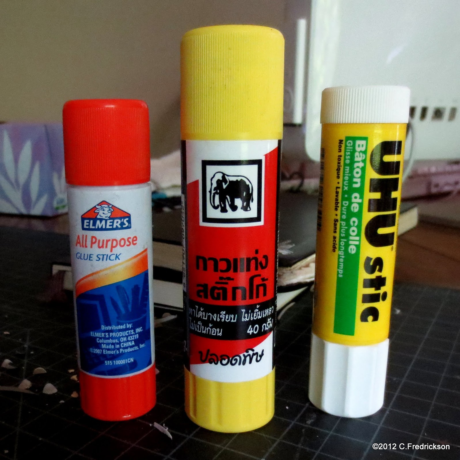
Opinions as Strong as Glue Stick

I'm sure everyone's been paying attention, but I feel like I need to be clear about my preferences in glue stick.

Is it urgent? No. I just like to boost for good products and warn against poor ones.

Is that geeky? Likely, but life's too short to want to be like other people, to live others' lives in replacement of one's own. And life's too short to be embarrassed—for very long—about flying one's freak flag.

I use a lot of glue stick (a lot) so I have some opinions about it. I've used it to craft and seal envelopes, to cover Moleskine notebooks, to wrap presents, repair library books, flyer around town, &c. In the course of using a lot of glue stick, one may develop a curiosity about alternative brands and, consequently, to notice trends and tendencies of one product against another. This is fine and natural, and I believe it's important to share one's impressions with others.

I'm sure I've used other, generic glue sticks before, and if I were very diligent I would run out and pick some up. I know Office Depot has a house brand, and Target probably carries alternate brands. I'm only reviewing what I happen to have on hand.

Tuesday, May 22

Spelling Beer Names Is Tricky

I try to let local businesses off the hook. They're working hard, they're doing good work (patronizing local businesses keeps two thirds of the money you spend within the community, as opposed to funneling it off elsewhere), and they've got a lot on their mind.

Taken at the Herkimer, Mpls., MN
I don't let major corporations off the hook. When they make errors, I take no little delight in highlighting these and parading them before a public audience, whether here on my sad little blog or on my favorite message board (which shall go unnamed). I feel that they should be better than a struggling mom-and-pop, in terms of professionalism. It would fill me with dread to think that a juggernaut of ineptitude and "that's good enough, I guess" could emerge to stake a national claim and go after the checkbooks of hard-working, decent citizens such as you and me.

Is that a double-standard? I don't think so.

At the same time, this was quite a slip-up. I like the Herkimer because they make great beer right there on the premises. I like them even more now that I myself am into homebrewing. I would love to sit in and watch while their guy goes about his business, checking the vats, mixing the grains (though I suspect much of it is automated). Yet someone wrote out that chalkboard sign by hand, someone had to have sounded out the letters while they wrote it, and someone had to have stepped back to admire their handiwork. Not to mention, other workers must have looked at this sign, as well as countless customers from all walks of life. Hipsters tend to settle in at our local bars like a plague of tasteless, undereducated locusts, but the Herkimer enjoys a broad spectrum of clientele, I think.

Someone should have noticed this by now, is what I'm saying.

Sunday, May 20

Required: Moleskine as Work Journal

Considering how much I love Moleskine, I thought I should delineate exactly what I use all mine for. I have a collection of notebooks that's dominating an entire bookshelf, and each book has specific functions, whether it's the regular notebook that always appears in every selection, the Volant, the Cahier, or all the other varieties and variations they produce.

I maintain a work journal, which I urgently request everyone try. The best and foremost reason for this is that you can record your triumphs and personal victories—as well as the details of any trouble in the office—to support/defend yourself around review time. When these annual reviews come down, you know you've done a great job but the particulars of your invaluable support may have slipped your mind unless you've written them down in a work journal.

Saturday, April 28

DIY Deco: Moleskine Notebooks

Now, anyone who's read EVERYTHING I'VE EVER WRITTEN EVERYWHERE may have detected by this point that I'm favorably inclined toward Moleskine (MOLL-eh-SKEEN-eh: I correct myself whenever I say it). And I have found there are two Moleskine websites: Moleskine (Europe) and MoleskineUS. Why are there two? I dunno, maybe it's just easier to have a European headquarters that takes care of all nations outside of the U.S.

The Euro Moleskine site has what they call an Artists Marketplace: users are invited to buy Moleskine notebooks, decorate them inside and/or out, and sell them here to a global market. I decided to try my hand and take the plunge, but so far there have been no takers. None from other countries, anyway: my friend Kate met me and, over ice cream, perused my selection and decided which (of the three I'd produced) she wanted.

Let me tell you about these notebooks. I purchased the pack-o-three "large" unlined Moleskine Cahiers with kraft covers. Among my statio is a file of old maps, so the notebooks are covered in a 1965 National Geographic world map. Their covers feature the South Atlantic Ocean (pictured), the North American continent, and the Scandinavian nations and northern Europe.

Piratical Typography


The Science Museum of Minnesota, which is awesome, is hosting a historical exhibit of what pirates were really like, as seen in the above bus shelter display. But if you're like me, what you notice almost immediately is the glaring typo. How did "takover" make it past all the levels of design, editing, proofing and print? It's not even a goof in the fine print: it's large, bold, and in decorative typeface.

I work in a marketing agency, and people in such agencies seem to know what each other are up to. I asked around to find out who was in charge of this campaign and someone thought, maybe, that this work might've been in-house. Trying to confirm that, though.

Stuff like this drives me absolutely crazy, having been an unemployed copy editor for eight of the past twelve months.

UPDATE: At least they're in good company.